Case Study: Amazon Payments Experience (APX)
Client
Amazon.com
Role
Sole designer from concept through completion.
Responsibilities
UX design, UX and widget strategy, quantitative and qualitative testing/analysis, widget experience and ecosystem architect, product evangelist, federated design and style coordinator, pattern czar, client onboarding and negotiation.
Duration
8 years from concept to 99%+ global adoption.
Summary
Fully encapsulated, stylable, configurable, and componentized payment experience vended through server-side rendered widgets.
The Impossible Problem
In 2011, Amazon was at a crossroads between the scrappy independent culture that had built it and the global behemoth it has now become. The company consisted of hundreds of independent teams with full control of their experience and technology stack. Amazon Payments consisted of a collection of backend services that clients called directly and each built their own customer experience with no top-down mandate for consistency, brand, tone, or feature parity. Each team was individually responsible for every payment feature and the experience varied wildly across the site. Since these clients coupled directly to backend services, often in very creative ways without any mechanism to audit their use, changing those systems had become impossible without breaking live experiences.
If a new payments feature needed to be added across the payments landscape, say for regulatory purposes, the work had to be coordinated across hundreds of individual workstreams and required duplicate testing, design, and development. To complicate things further, the company was growing exponentially in domestic scope, scale, and into new international regions that required new cultural understanding, regulatory variation, and new payment methods.
Collectively, Amazon Payments was on the verge of collapse. A solution was broadly considered impossible to orchestrate without major cost and reductions in speed, growth, and experiential control.
Organizational History (No payments designers)
Historically, Amazon Payments only employed designers for internal payment products like gift cards and other bespoke payment methods. The broader payments experience was delegated to individual teams. The bulk of payment features were developed directly in the retail shopping experience and were not sharable to other teams. Amazon had no mechanism for cross-team experiences. The culture operated fast and loose with a high degree of organizational freedom and was very guarded of individual team control.
Discovery
When I began, I needed discovery in two dimensions:
- Experience. I needed to understand the full scope of the payment lifecycle from purchase initiation through checkout, order and shipping behavior, returns, and post order care along with payment method and order management.
- Clients. I also needed to understand how those primary experiences manifested themselves across the hundreds of existing payments pipelines and how those pipelines interacted.

Documenting the Experience
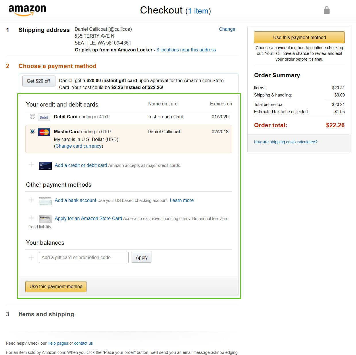
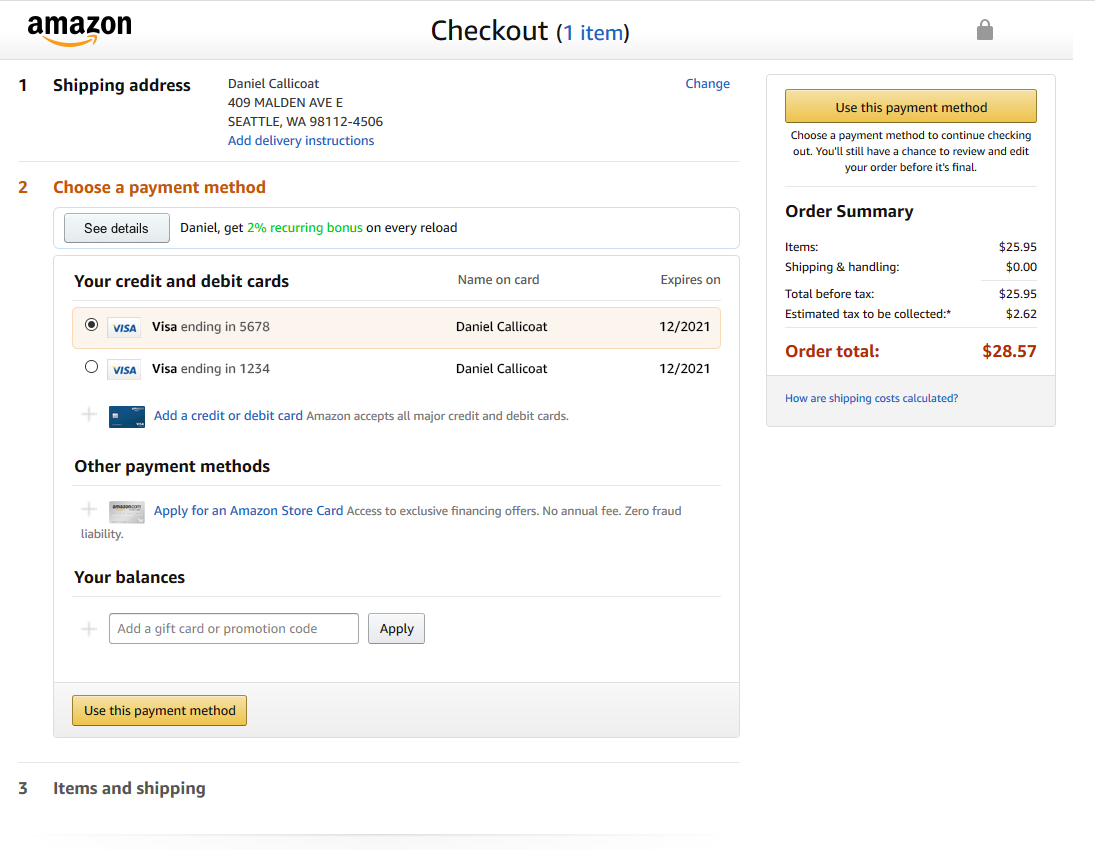
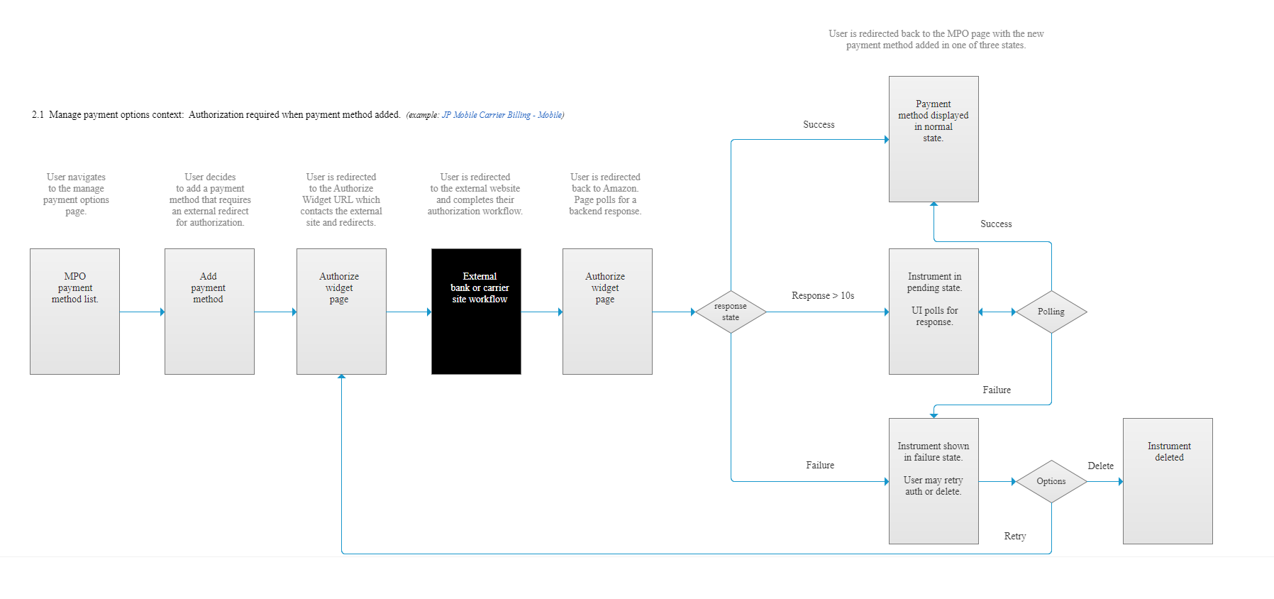
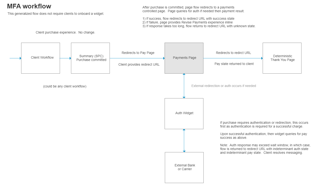
There was no existing documentation on the Amazon Payment experience so I had to start from scratch with a sitewide audit. I created a test account with test payment methods and began documenting the lifecycle of a purchase end-to-end within the retail checkout workflow. This experience extended into Account Management, Order Details, Returns, error states, etc.
I started with a basic credit card for one product and then subsequent products to discover variations, then on to additional payment methods. I then created comprehensive design documents that our development team used to catalog features and build a development plan.
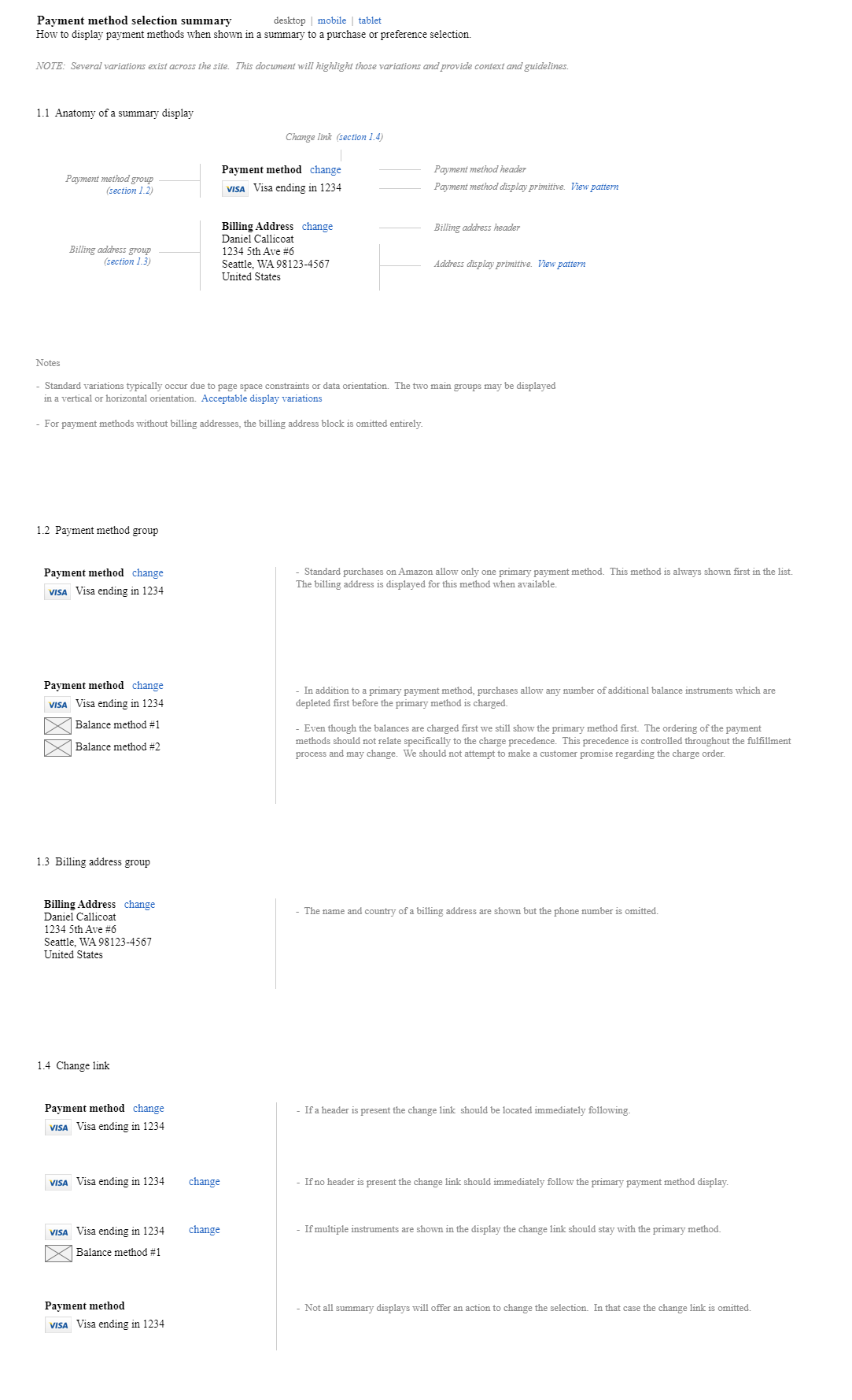
Eventually, I created a detailed global pattern catalog to inform federated design.

Building Client Relationships
I needed to both understand variations in non-retail experiences and broadly understand the landscape that faces non-retail clients to inform ecosystem features and the political nuances that we would be existing within.
My approach was a social one. I would identify a team, research the lead designer or if none, the lead PM, and reach out with an invitation for coffee, drinks, or an informational interview. This also helped build strategic relations and familiarity and evangelize the technology that we were building, all very important aspects of the project.

I identified three unique cohorts of clients:
- Small / long-tail clients
- Medium non-retail clients like Kindle or Amazon Prime
- The megalith Amazon Retail Core Shopping and its affiliates
I also discovered a good deal of co-mingling of general payment features vs client specific features which needed to be untangled and reconfigured.
Concerns and Requirements
After a couple of months of discovery I compiled this general list of concerns and project requirements:
- Unique elements exist in every client experience that would need to be incorporated into the global feature list or decoupled from payments.
- A high level of control is required, both in the experience and in the release workflows to time launches and orchestrate resources. Bottlenecks were of high concern.
- Ease of implementation and maintenance. Small clients did not have dedicated resources with payments experience to manage payments complexity.
- Styling architecture. Each client has created their experience using novel styling architecture so that the Data Object Models (DOMs) were unique. In addition to coordinating style across widgets, those widgets needed to match the style of the parent client page seamlessly.
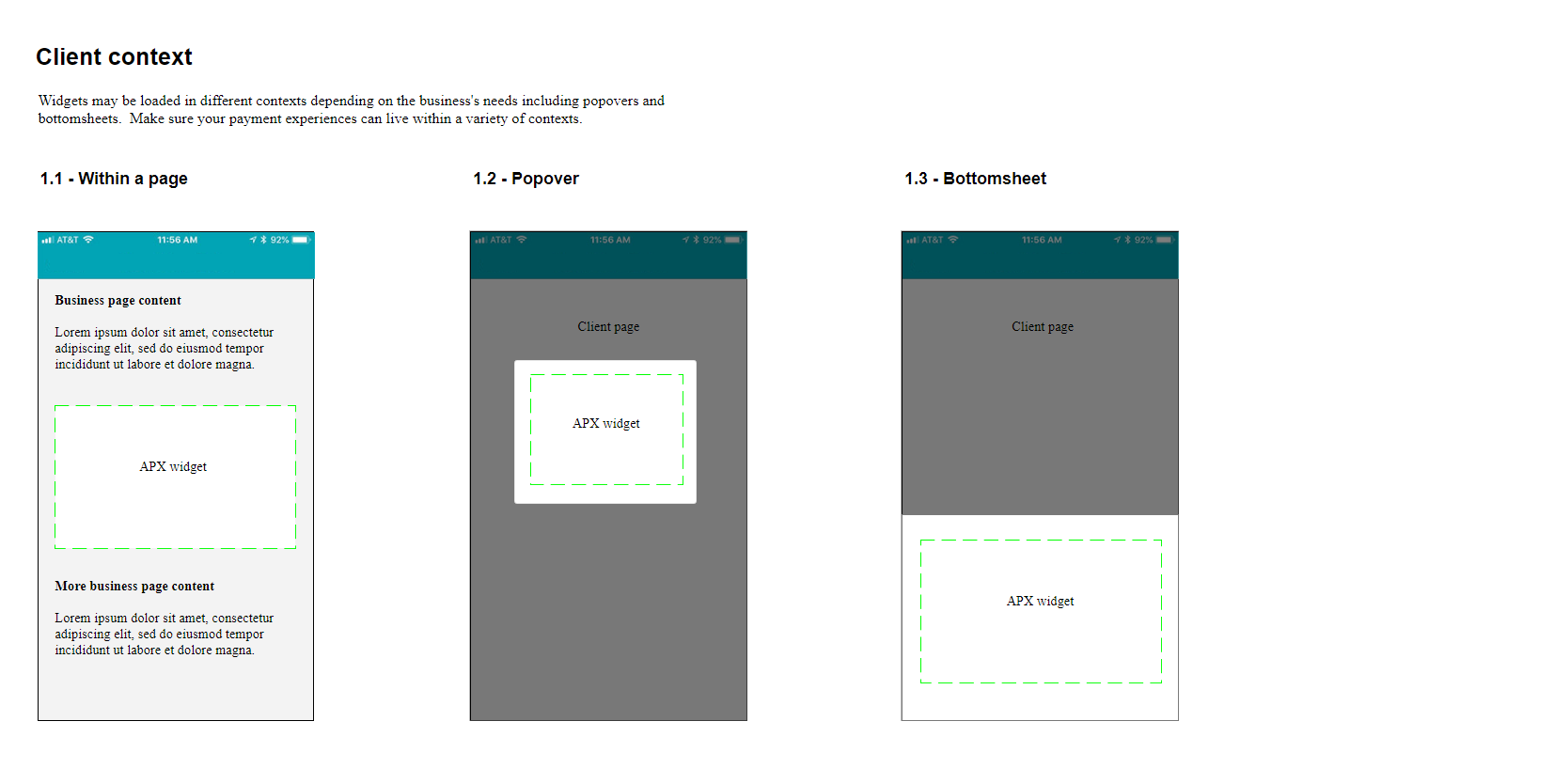
- Broad format. Clients required payments on web, mobile, and tablet, for html, non-html, standalone devices like kindle, and set-top contexts. They also required legacy support for all existing experiences in the wild – many that were unable to be modernized. Amazon maintains an extensive legacy browser and technology support requirement.
- Longevity. Once integrated, widgets would need to grow seamlessly for decades without future integrations with clients, which would be prohibitively expensive.
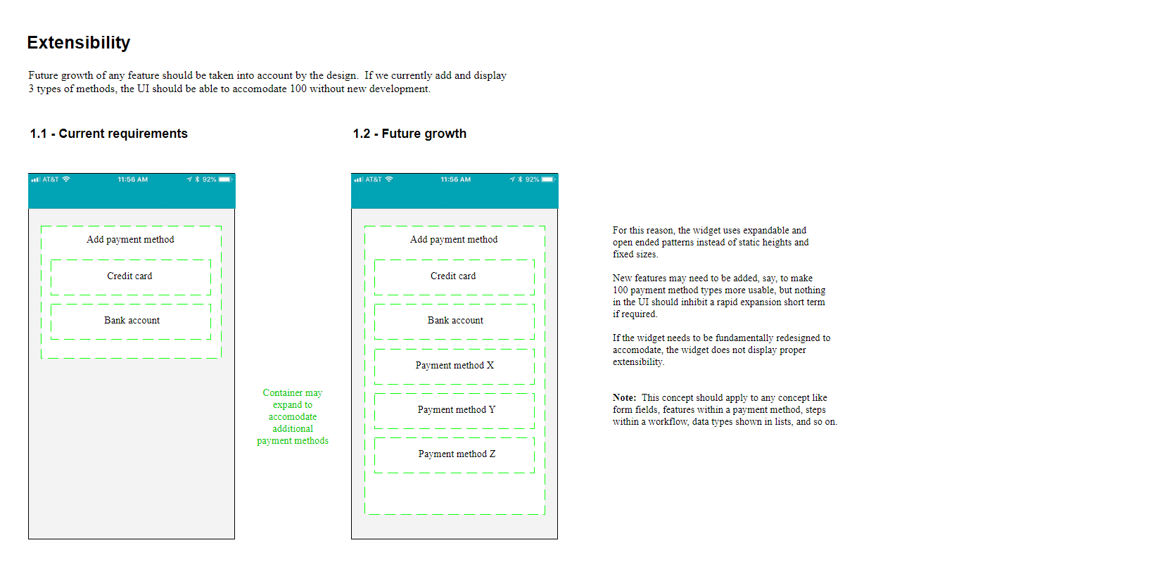
- Extensibility. The experience needed to support an infinite variety of payment methods, an infinite number of each payment method, with infinite variation of workflows, and infinite space for individual payment method features, fixups, and error handling.
- Progressive enhancement. Amazon Core Shopping was built using progressive enhancement which required the experience to work end-to-end without javascript. Javascript enabled features are secondary add-ons.
- Accessibility. End-to-end experience had to be compliant with all accessibility standards including screen readers and all Core Shopping standards set by internal accessibility oversight teams.
- Political complexity. Inter-team cooperation was highly political with complex histories to acknowledge. Medium teams were sensitive to being second citizens in shared technology. Large teams were opposed to shared systems or loss of control. Both were resistant to compromises to broaden payment features required by small teams.
- Scope. The experience would need to recreate the baseline Retail Core Shopping feature set that had taken decades to build and add to that every experience built by any of hundreds of other teams. We would need to incorporate all global experiences which were currently broken up between separate stacks in the US, Europe, China, and India.
- Metrics. The new widget experience would need to achieve a zero loss metric across the board, competing with highly integrated and optimized workflows without predictive preloading and client based technology.
- Growth. We have a fast moving target. Client growth, feature growth within clients, and regional expansion are all exponential.
- Authority. No top-down authority or mandate exists to drive adoption. All adoption is voluntary and based on product merit alone.
- Existential threat. Many existing teams maintain their own payments design and experience groups. A widgetized system threatens not only client control but many real jobs.
- Visual style. Many divergent brands/styles exist. A single UI would need to support the major Amazon brand, sub-Amazon brands like Kindle or Prime Video, and externally branded subsidiaries like Twitch and IMDB.
Technological Reality
Payments workflows are tightly coupled with backend capabilities and stately flows. Low development bandwidth required basic UI functionality initially with strategic enhancement as time allowed. Development-led team required a strong experience advocate from vision level discussion down to sprint level tasking.
The Solution
After deep analysis the solution became clear but would be difficult to enact:
- Create an abstraction layer between pipelines and the backend services.
- On top of the abstraction layer, create a widget suite to replace all existing payments-related experiences in all pipelines. These widgets will accommodate all existing payment features in every region and on every surface.
- Voluntarily onboard every payments pipeline to the payments-controlled widget. This will unify payment patterns across Amazon globally.
- Move to a universal styling architecture with object abstraction to enable growth and consistency long term.
- Every pipeline now has full access to the entire breadth of Amazon payment features and every subsequent feature with no additional development or effort.
- Backend services are now free to grow and change without unique pipeline dependencies.
- Extension: this system can be productized and sold externally as an SaaS product like Amazon Web Services.
Tenets
Building core tenets eases difficult decisions later on and unifies the product vision during design. Once established, disagreements can be externalized by matching issues with the corresponding tenet for clarity.
- Consistent
Users should have a consistent experience across APX within a business (between purchase, post order, wallet, etc.) and across businesses. The styling and purchase flows may be different but the payment experience should feel familiar and safe. - Encapsulated
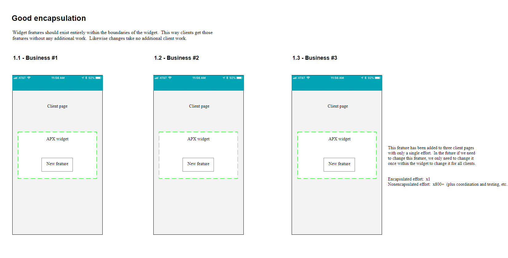
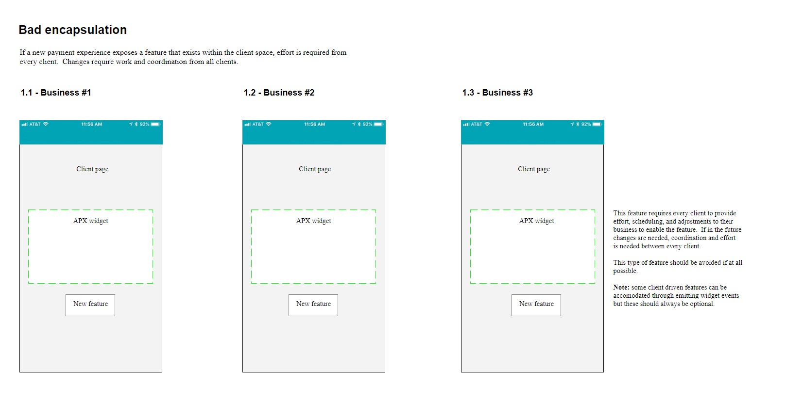
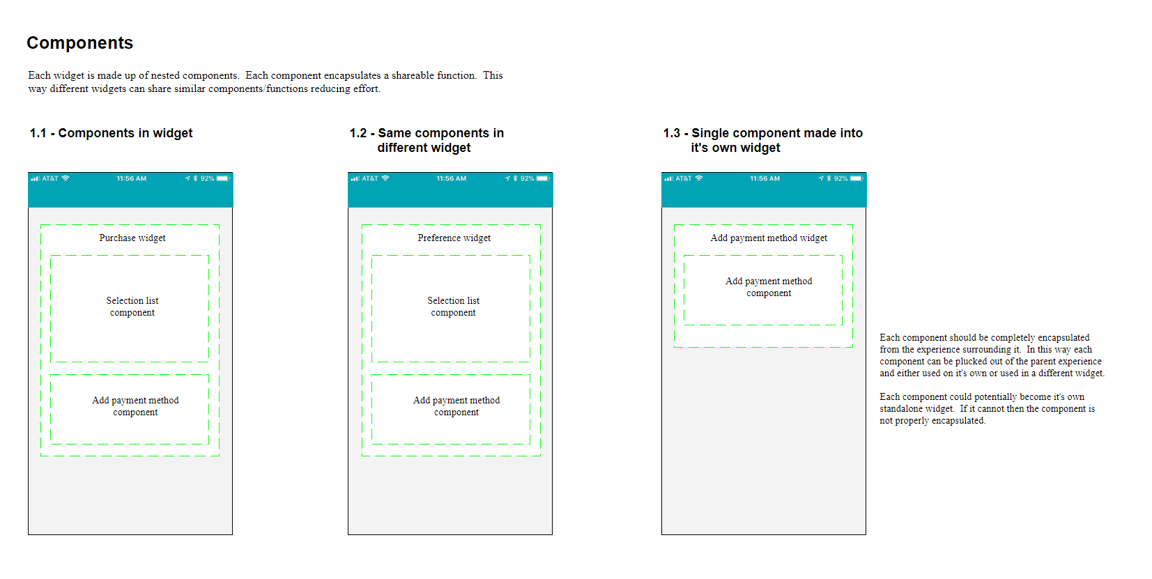
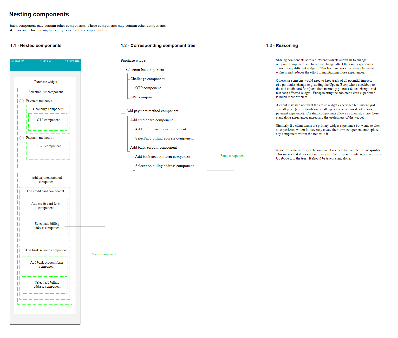
The APX experience should be decoupled and encapsulated from the client experience. Each discreet feature within the widget including nested features should be encapsulated from one another. - Focused
Localized action is preferred, keeping relevant interaction at the point of focus instead of linking out to other pages. - Extensible
Design should be flexible enough to exist in a variety of widths and extensible enough to allow for the growth of new instruments and new features within those instruments without additional restructuring. - Concise
Active prejudice towards simplicity and concision; design should be uncluttered and expose features at the appropriate level of interaction. - Clear and transparent
Users should understand the relationship between their actions/selections and behavior of the site in order to make an educated purchase decision. - Stylable but consistent
Design should be stylable and respect a business’ brand but should not break the consistency of the payments patterns and experience overall.
General Widget Principles – APX 101
These tenets could be achieved by using a set of guiding principles that underlie APX widget design.

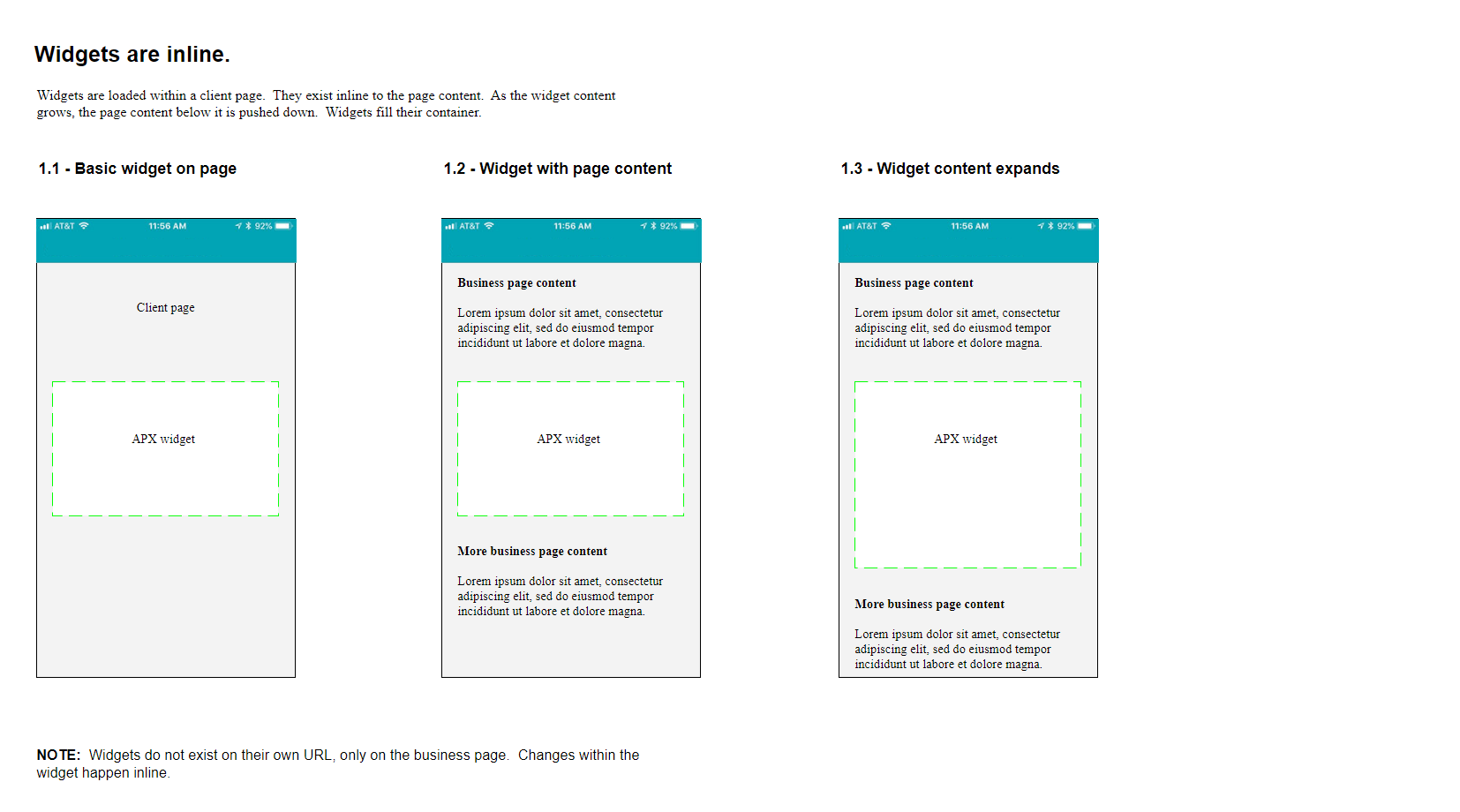
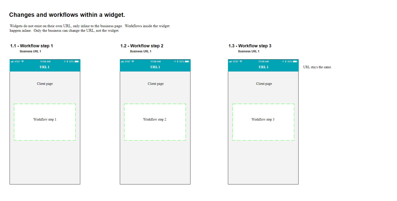
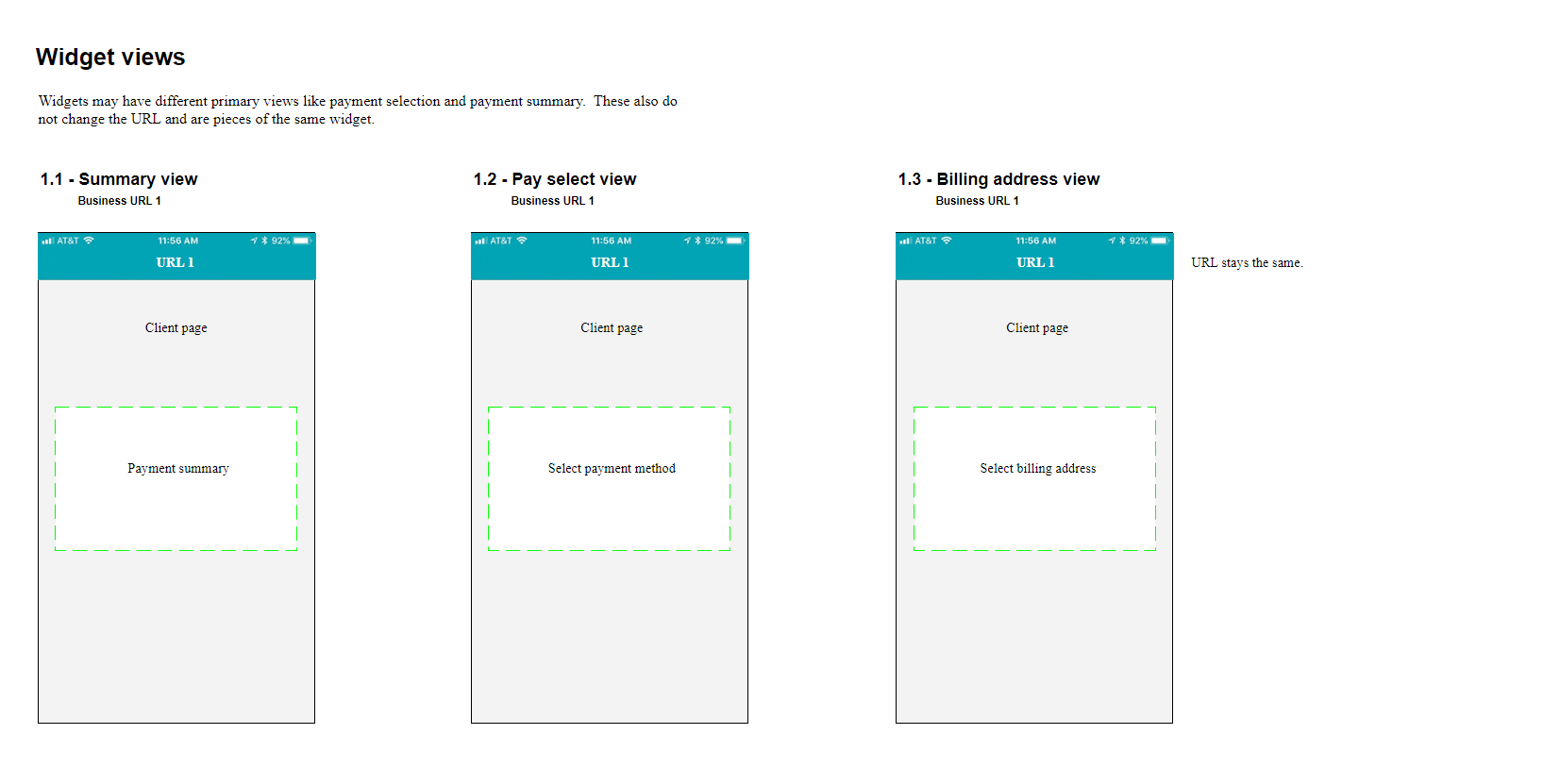
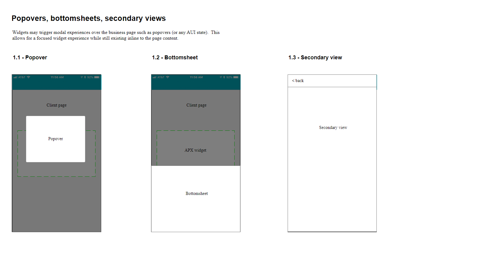
General Strategic Approach
- Partner with a medium-sized digital client. Focus on their specific needs.
- Prove Return on Investment (ROI) short term.
- Prove value to other medium sized digital clients.
- Create foundations for small, low-requirement clients to onboard immediately.
- Foster confidence with concrete ROI to increase budget for acceleration and team growth.
Design Strategy and Partnerships
- Mimic the Core Shopping aesthetic as the brand north star to rationalize existing variation.
- Rework the outdated multipage pipeline used by most of the company with consistent brand and patterns.
- Create a universal styling architecture by partnering with the new Amazon User Interface (AUI) team. AUI provided a generic DOM that could be styled but abstracted objects to allow for growth-over-time. (I made this a requirement of the product.)
- Produce an AUI stylesheet for each client. As the north star evolved, AUI would keep the product in sync.
- Enhance Core Shopping patterns over time to be more extensible and adaptable across a broader landscape of experiences with concrete examples of their importance.
- Lay the foundations for a single global Amazon payments experience owned by the Payments team backed by years of data and positive alliances.
Initial Widget Design in Retail Context
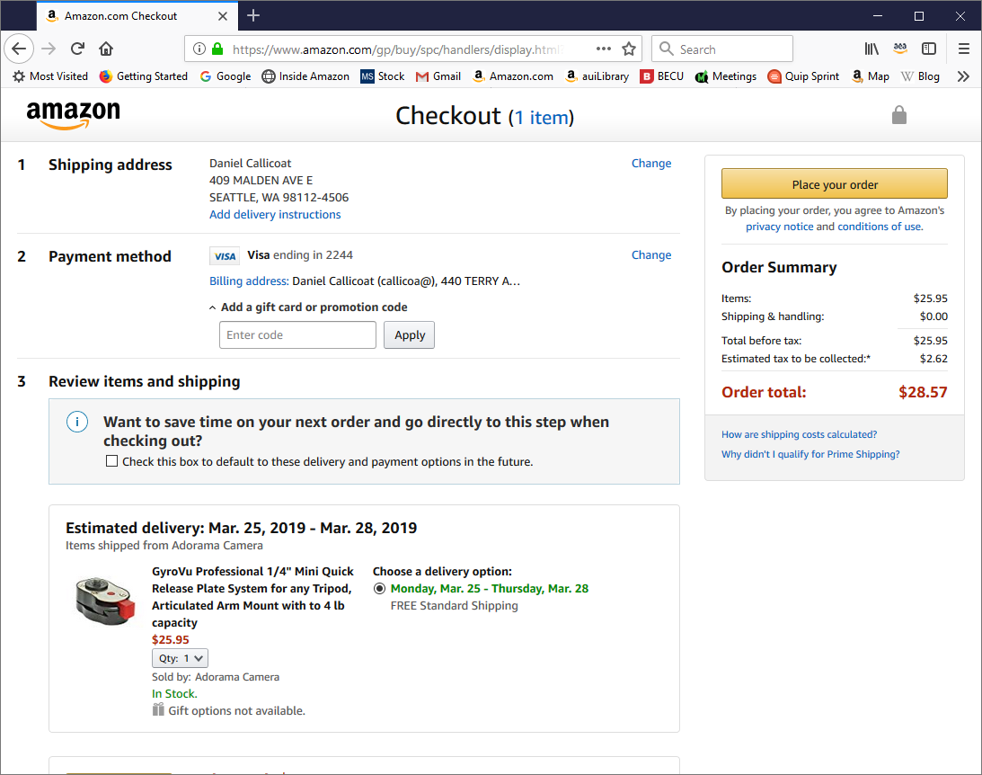
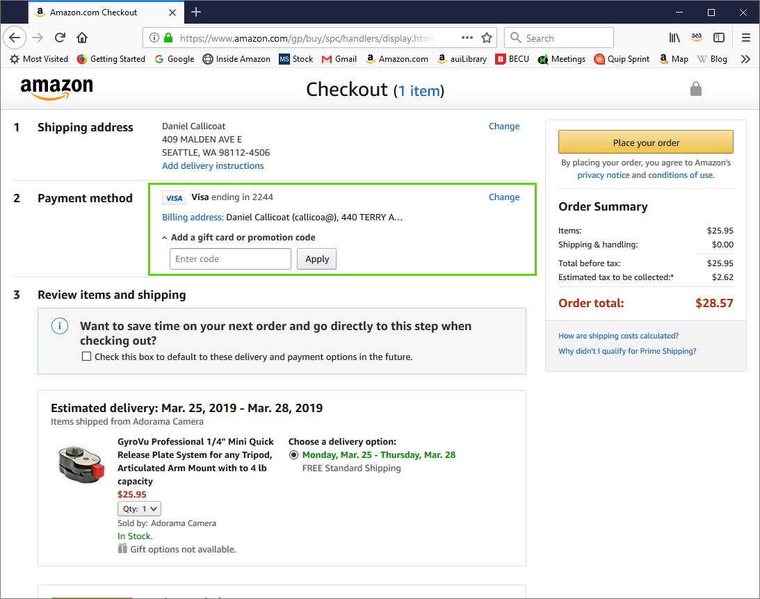
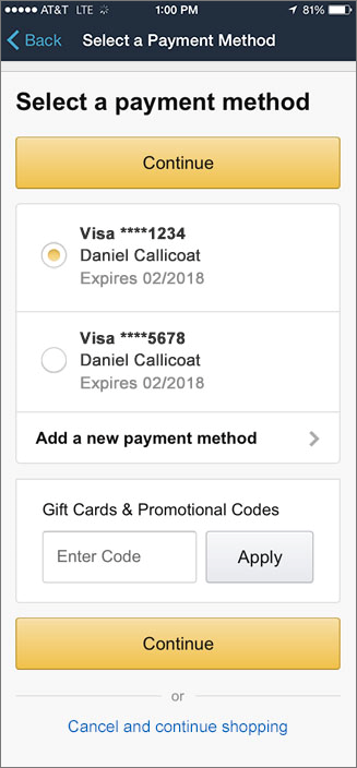
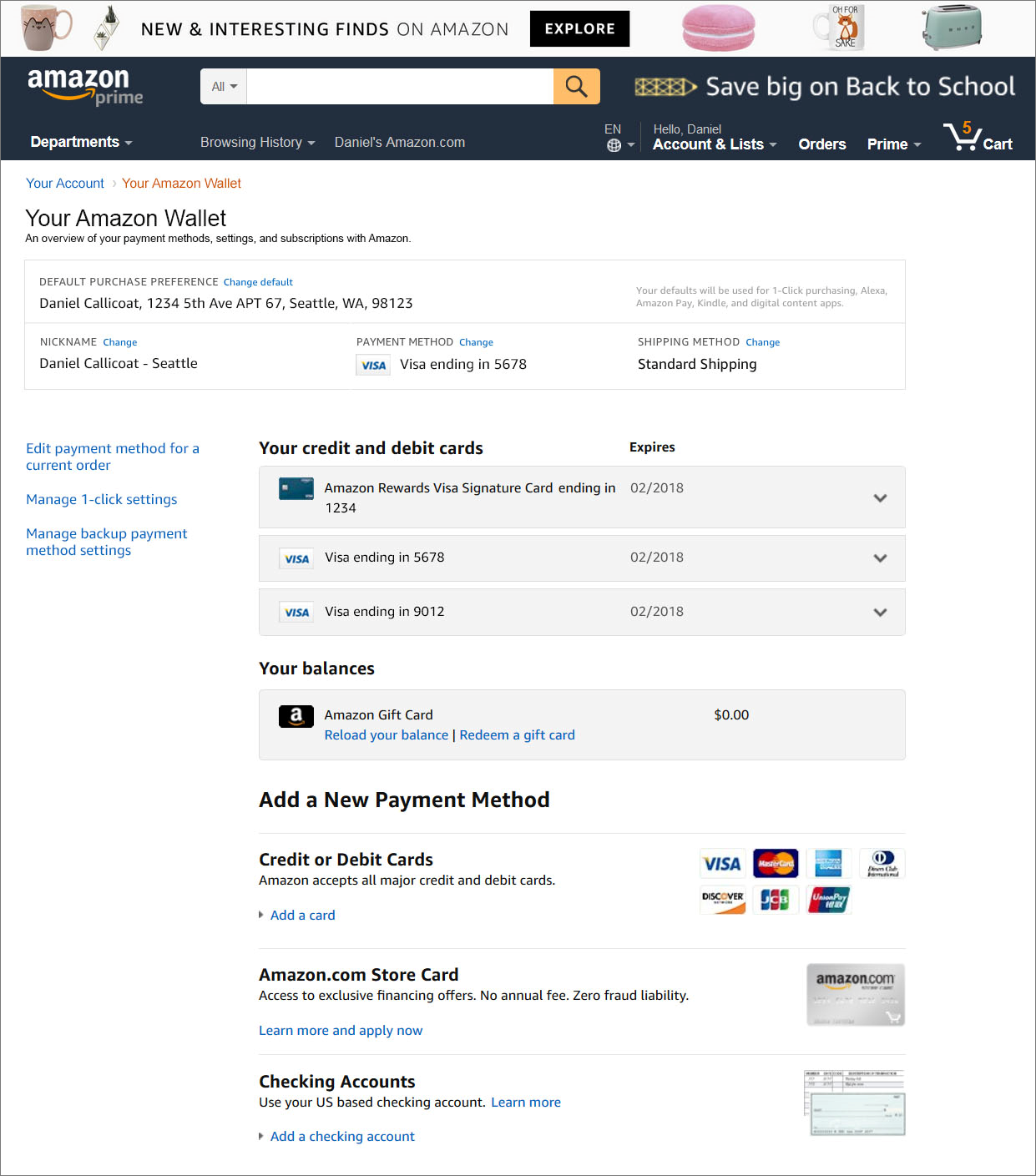
I first created a full spectrum design of payment widgets within the Retail Shopping Single Page Checkout (SPC) pipeline on desktop as a baseline. I then adapted those patterns for the more broadly used classic multi-page checkout (MPC) desktop experience so that a single widget base could serve both pipelines. This became our foundational bridge. All clients used a multipage approach to mobile so I could consolidate those experiences. Payments Management existed on a shared Payments controlled page which I redesigned to use APX widgets.
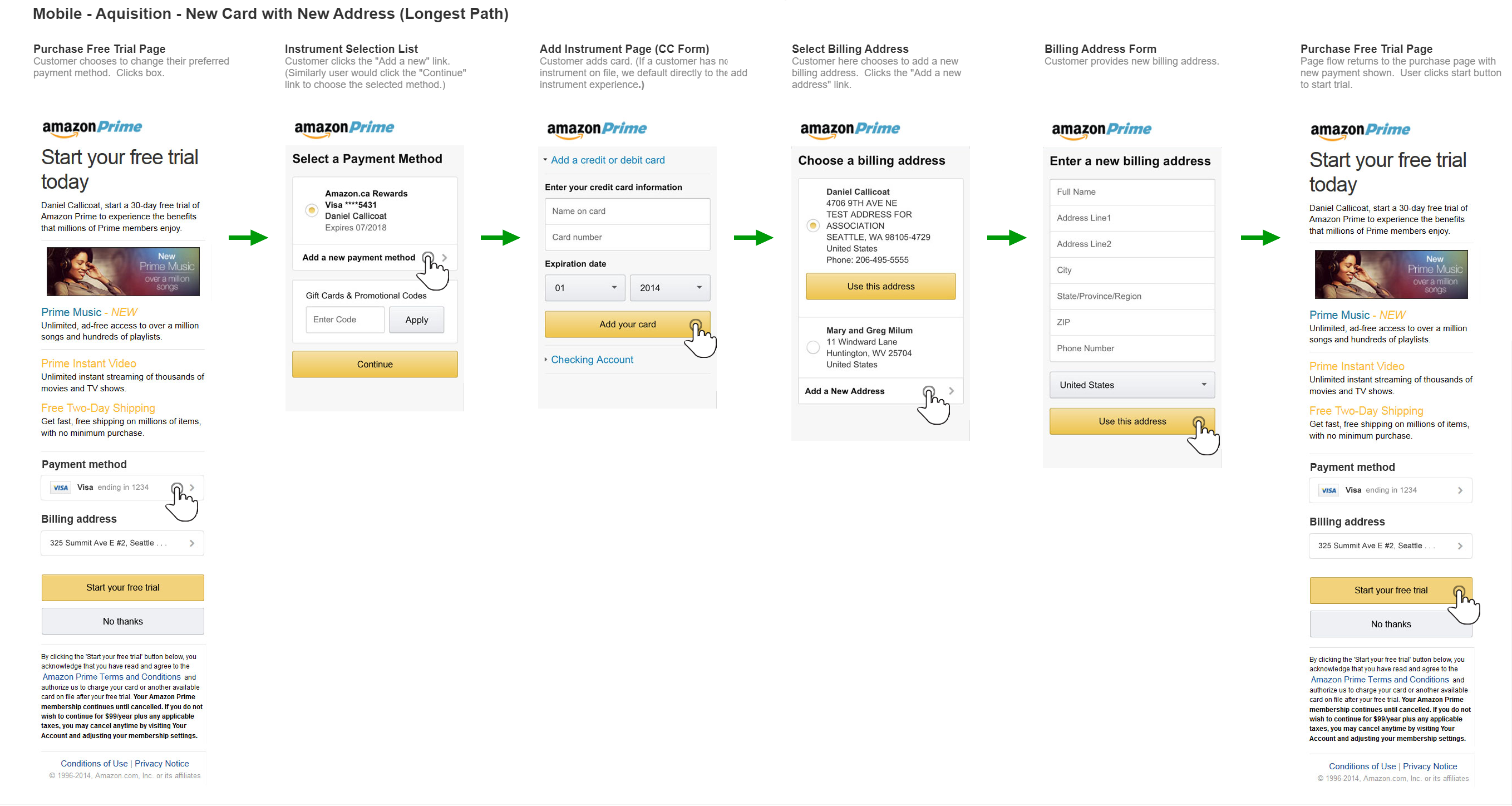
First Clients
We partnered first with Kindle. Their single purchase pipeline required all of the basic payment features but was easy to encapsulate from their client space. This laid the foundation for other digital clients like Amazon Video, Amazon Music, Audible, Amazon Photos, Amazon Appstore, etc. This also provided a healthy feature list for small clients who began to seek us out for a cheaper alternative to custom development. Working from a medium-sized client perspective allowed us to craft our systems to decouple bottlenecks and focus on client freedom to evolve and control their roadmaps. This eventually resulted in our fully federated development model.
Success Metrics
Reluctant clients required zero-loss metrics across the board. Existing client experiences could be highly optimized, preloading several pages before entering the payments pipeline. This could only be achieved in a widget by rebuilding the core systems themselves coupled with an incredibly fast UI with greater and faster completes and less abandons.
Our overall goal for the product was 99%+ adoption by global Amazon payments traffic. This included full adoption by Retail Core Shopping, our long pole. This took 8 years to accomplish.
Iterate, iterate, iterate
- After successfully launching Kindle, we moved on to all of the other digital based medium sized clients (Amazon Video, Amazon Music, Audible, Amazon Photos, Amazon Appstore, etc.).
- New clients began using APX instead of investing in custom development.
- We began to accumulate a backlog of long-tail businesses with unique needs.
- Internal payment products began adopting APX.
- External subsidiaries migrated to Amazon Payments technology via APX.
- Each new client made the product more diverse and capable.
- Each existing client gained capabilities without investment.
- Our strategy began to work and accelerate.
Widgetizing Standalone Retail Payment Features
In addition to the general payment workflow, many payments features with their own standalone teams are integrated directly into the Retail Core Shopping experience with tight coupling. I worked with these teams to encapsulate those features into APX components that could be shared across the APX ecosystem, greatly increasing the ROI of those teams.
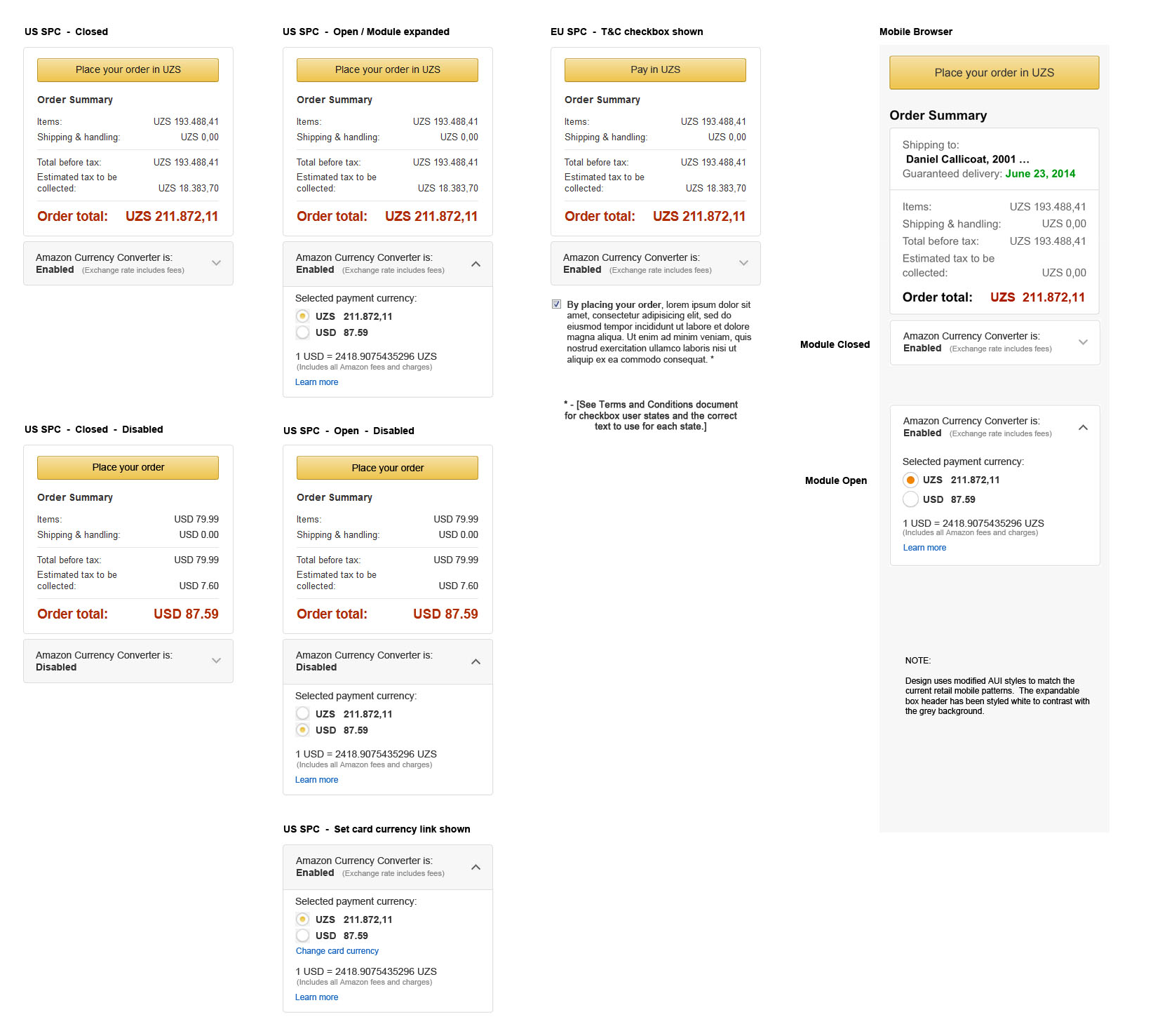
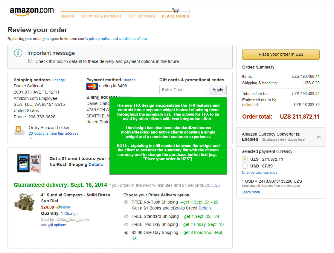
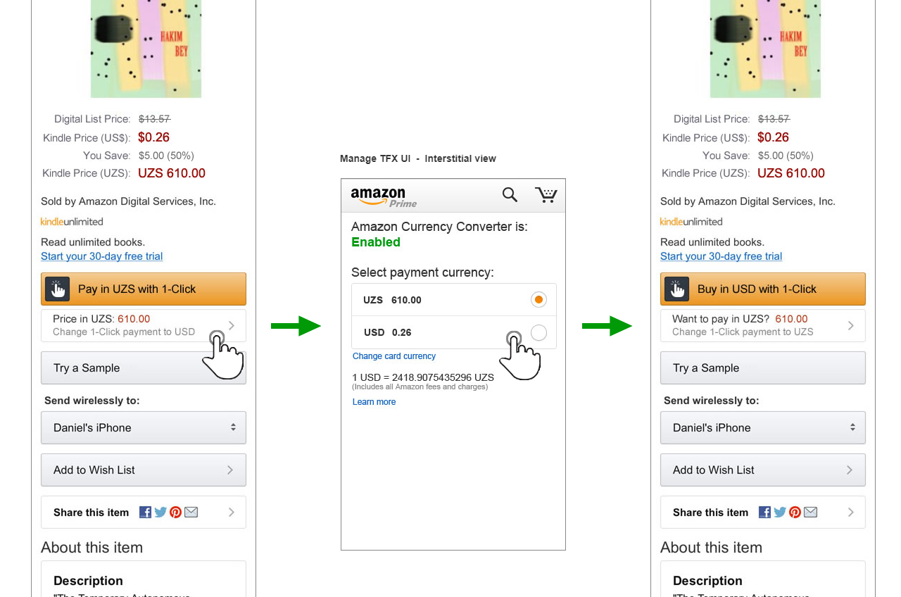
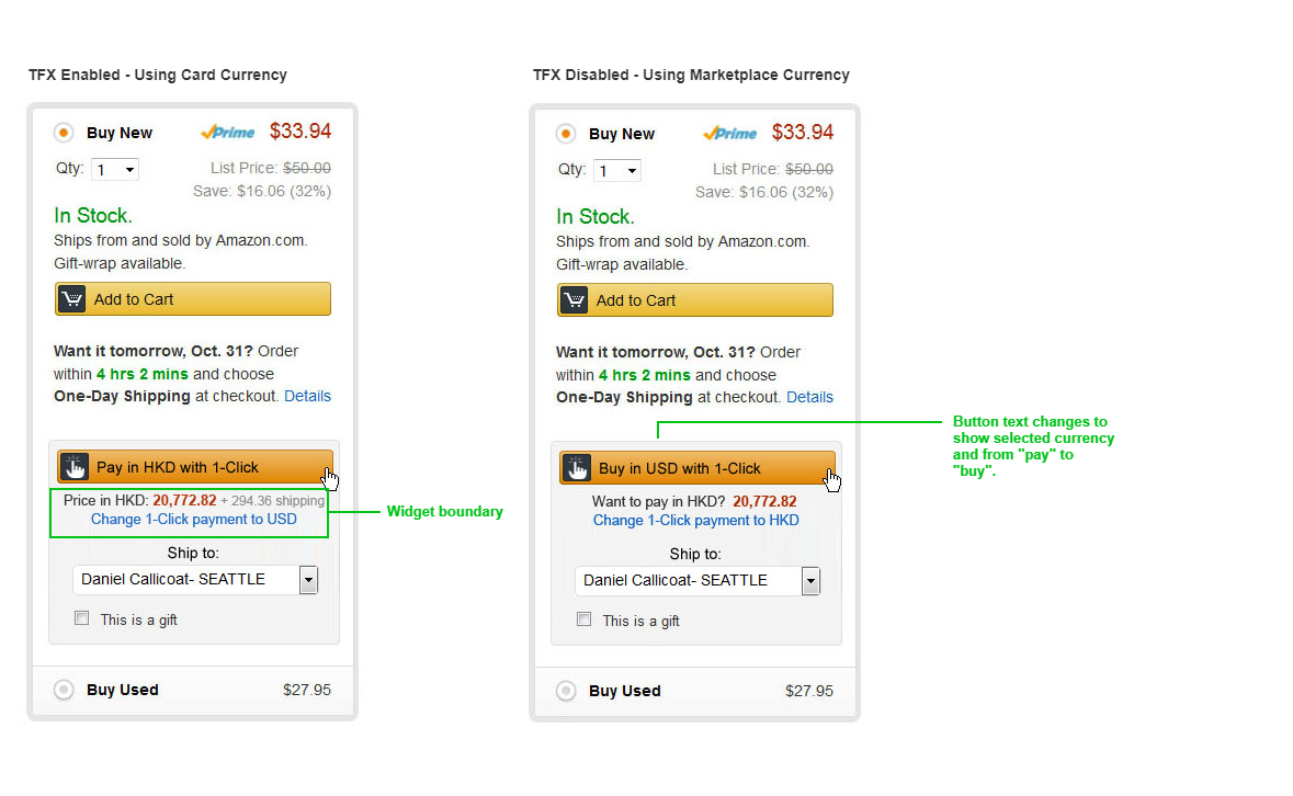
Below is an example of the Amazon Currency Converter (TFX) feature which was originally spread throughout the Core Shopping payment summary. I disentangled it into a standalone module easily shared on desktop and mobile experiences.
Building a Federated Ecosystem
Over time it became apparent, no matter how large we grew the internal team, we would always be a bottleneck or interfere with client roadmaps. Instead of fighting for control, we leaned into the demand. We built external development rails so that any team could either enhance existing functionality for the ecosystem using their own resources or build custom components to entirely control certain aspects of their payments experience. I started holding office hours to review external designs, unify patterns, and generally oversee the longer vision of the product. Likewise, business and dev representatives would influence their own spheres. This format became a force multiplier and accelerated our growth and adoption even more.
Expanding Client Tools
With all of the potential variation and detailed customization, robust and easy to use client tools were required. Each payment method could potentially have complex multi-stage and multi-variant workflows with customizations buried deep within. WYSIWYG style controls were important to fully demonstrate the effect of customizations throughout but workflow complexity hindered easy visualization. Eventually we had to create a custom form of markup language that could track experiences through workflows and quantify UI state within flows so that custom UI addressing could be associated with control UI and display the correct state per control.
Creating a Payments Experience Bar Raiser Program (PXBR)
Ad hoc office hours grew into an official payments program that was given specific authority over payments designs and experience. Amazon has many “bar raiser” programs that serve an advisory role and educate designers on best practices and broader vision. Once APX had achieved a critical mass, the PXBR became my primary role, allowing me to affect change across a high number of clients and evangelize proper payments patterns and thoughtful encapsulation of experiences. This was an important element of steering such a vast and federated mechanism and allowed for the minimization of experience proliferation and complexity that often chokes and incapacitates such systems.
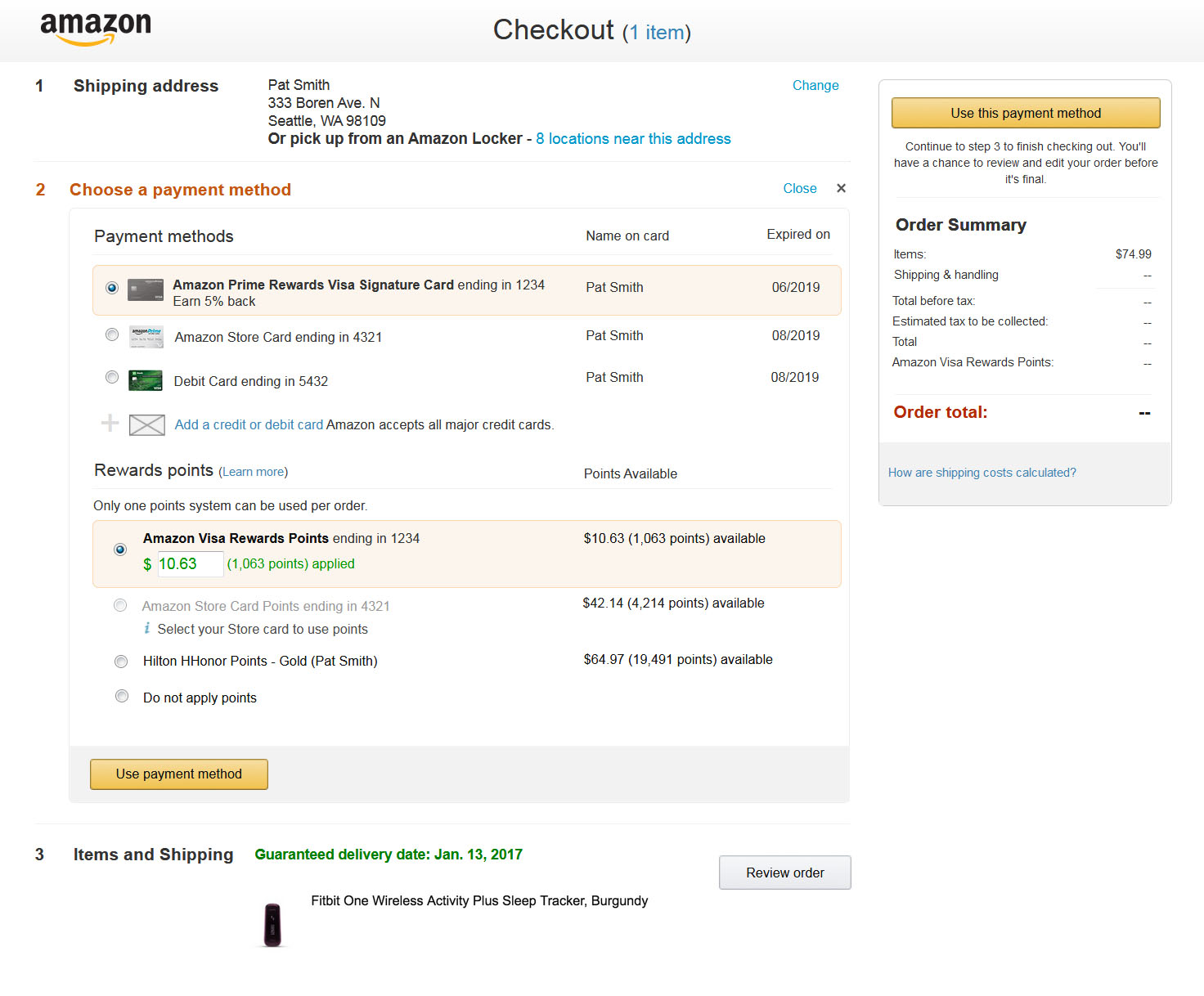
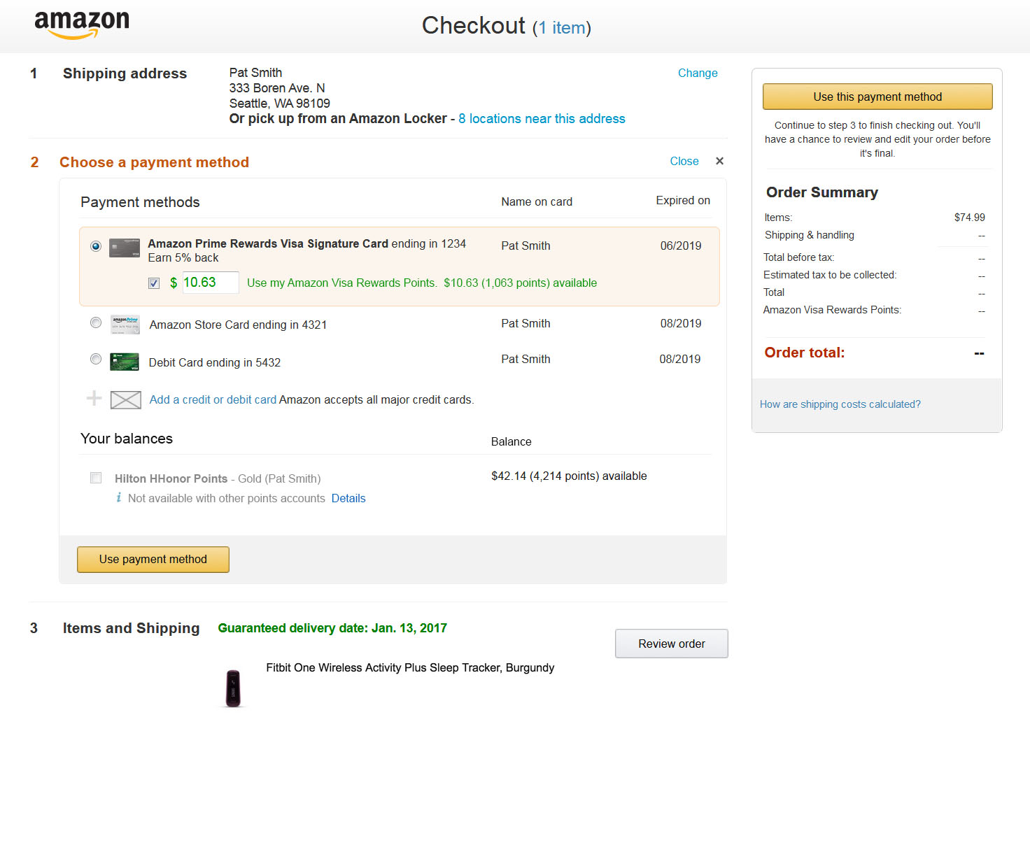
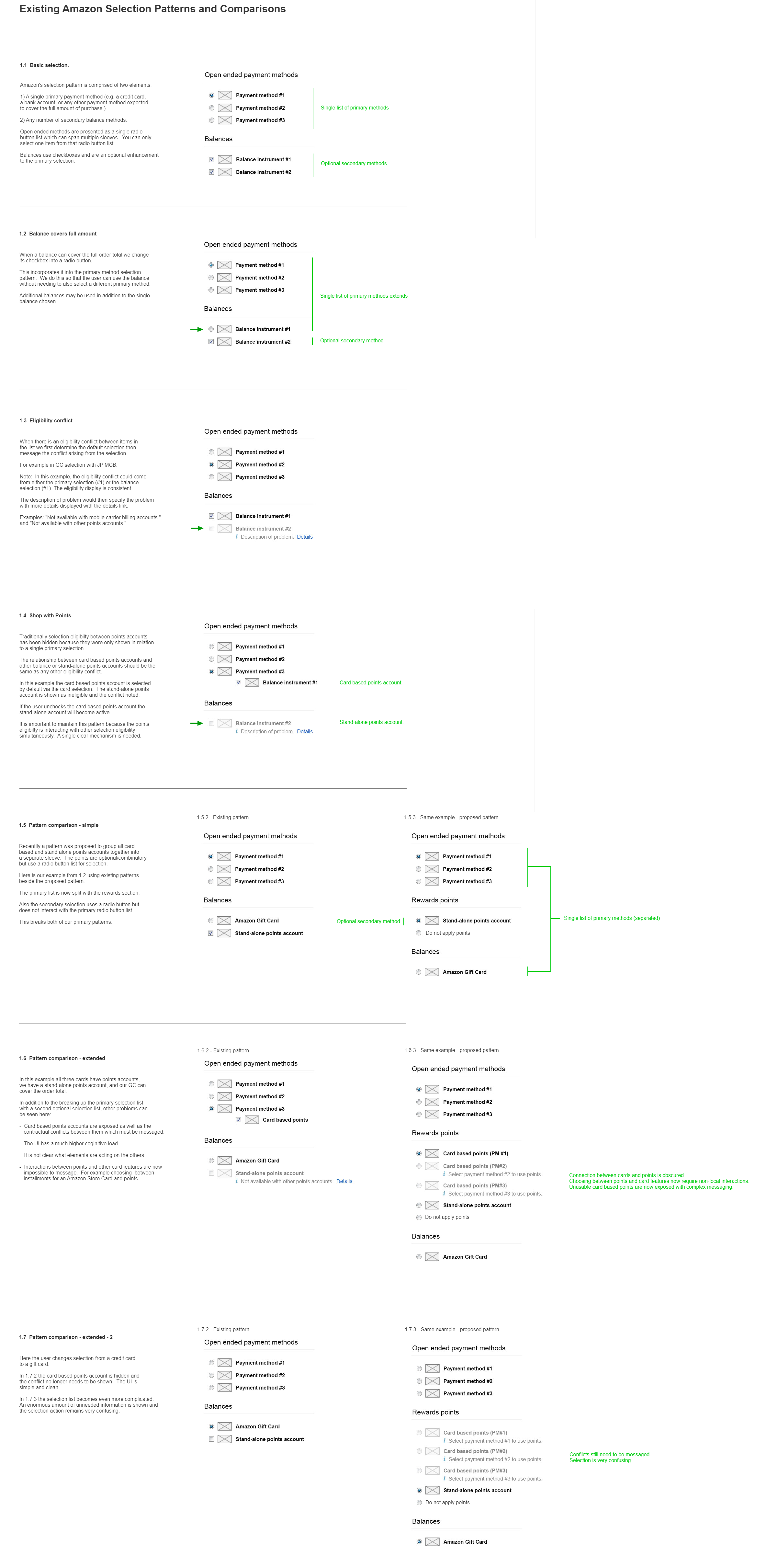
Below is an example one of the many design discussions I would engage in over a week. Here, a designer wishes to create a new payment method sleeve to group all points accounts together. Once the proposed pattern is analyzed against feature growth and extensibility, clear usability problems appear with the proposed pattern. An alternative design is provided using the best widget patterns.
My role over time. Growing an internal design team.
For the first five years of my time at Amazon, I remained the sole designer for not only the APX product but for all new payment method/feature design domestically and globally. I found myself juggling 25-30 projects at a time at an unsustainable pace. After our 5th VP level reorg, a design organization was finally funded with a broader purview. Under a new director, I helped hire a UX Manager and 6 additional designers that could spend more time and be more thoughtful about complex international payment methods and other internal product explorations. I remained an IC dedicated to the APX project running the PXBR program and provided similar oversight to the new team.
